IronBirds soaring into 2022 with updated look
The Aberdeen IronBirds are going back to the future. Entering their 20th season, the High-A IronBirds unveiled a new look for 2022 that takes a page from the franchise’s original identity while creating a fresh image for the next generation of Aberdeen baseball. “We call him Ace the Jet, and
The Aberdeen IronBirds are going back to the future.
Entering their 20th season, the High-A IronBirds unveiled a new look for 2022 that takes a page from the franchise’s original identity while creating a fresh image for the next generation of Aberdeen baseball.
“We call him Ace the Jet, and he is fairly reminiscent of our first logo from back in 2002,” IronBirds general manager Jack Graham said. “A big component of why we’re doing this now is because 2022 is going to not only be the 20th anniversary of our first season, but because we missed a year in 2020, it’ll be the 20th season. We can get sort of a two-for-one there.”
Ordinarily season totals and anniversary celebrations are a year apart, but with the cancellation of the 2020 season due to the pandemic, the IronBirds sought to take advantage of a unique moment in their franchise history. The redesign of their visual suite didn’t start just last year, though. It began with the addition of in-house graphic designer Kevin Jimenez from the Brooklyn Cyclones.
“KJ is probably the single most talented graphic designer in Minor League Baseball,” Graham said. “I’d put him up against any team employee or any agency. We’re lucky we were able to do that.”
Shortly after Jimenez joined the IronBirds in 2018, he was tasked with revamping the team’s brand.
“He took inspiration from the original logo,” Graham explained. “He took inspiration from the Orioles’ script that runs across the front of their jerseys. He took inspiration from the trends that have been happening in Minor League Baseball with really fun, friendly looking logos like the [Rocket City] Trash Pandas and [Montgomery] Biscuits and [Akron] RubberDucks and [Jacksonville] Jumbo Shrimp, all of those brands that are making a splash across the country in terms of merchandise and awareness and brand recognition, but he made it our own.”
The result is a new anthropomorphic fighter jet that looks as at home as a Minor League logo as it would in a Pixar movie. Streaking through a script “A,” the plane also features an “A” on its tail. That's a nod not only to the city it calls home but also the franchise’s original logo, which sported an “8” in the same spot in honor of owner Cal Ripken Jr.
“Ace the Jet came out of an offhand logo that [Jimenez] created looking at the old logo,” Graham said. “He said, ‘You know what? I want to create a new version of that old logo and start using him.’ We created Ace the Jet without that necessarily being the original plan for our future primary logo. We put him on some staff polo shirts, put him on some promotional material, and fans responded well to it.”
The mood of the IronBirds’ color scheme has been lightened, too. Charcoal is out. Light blue, royal blue and the orange of the team’s parent club are in.
In contrast to a longstanding trend across sports of logos looking meaner and more aggressive, Minor League teams have begun creating logo identities that project a more fun, friendly image befitting the product they put out night after night in spring and summer months at ballparks across the country.
“We’re not trying to be intimidating,” Graham said. “We’re not trying to have our logo be something that stands up against other logos in terms of ‘We’re angrier than you, we’re stronger than you.’ We’re trying to be family-friendly, and we’re trying to draw a new generation of fans. I think that people will be much more willing -- men, women or children -- to put this logo who’s friendly and approachable and generally representative of our community on a shirt or a hat or something like that, rather than having it be something that needs to be worn to a sporting event where you’re going to win.”
Aberdeen last changed logos ahead of the 2013 campaign, opting for a more menacing, futuristic bird as its centerpiece. This past season, the IronBirds moved up from the short-season ranks for the first time to become Baltimore’s High-A affiliate.
Owned by one of the greatest Orioles of all time and located just 35 miles northeast of Camden Yards, the IronBirds aimed to keep their franchise ties evident for the landmark season.
“We wanted to remain something that’s identifiable to Orioles fans and to Birdland, but have it be our own fresh identity and not lean on the black and the gray and the orange as much as we have in the past,” Graham said. “We’re just excited for what this will bring for us in terms of the 20th anniversary because there will be a special 20th anniversary logo as well that will appear on merchandise and giveaways.”
The IronBirds worked in conjunction with the Orioles to nail their new script wordmark, evoking that of their parent club with everything from the proper angle of the script’s tilt to the thickness of its font to the kerning of its letters.
“[The Orioles] are such great partners on the field, it only made sense to engage them off the field with our branding and make sure that we’re still letting people know that we love them, they love us, and we’re all one big bird family,” Graham said.
Tyler Maun is a reporter for MiLB.com and co-host of “The Show Before The Show” podcast. You can find him on Twitter @tylermaun.
2025 Crab Feast Dates ANNOUNCED!!

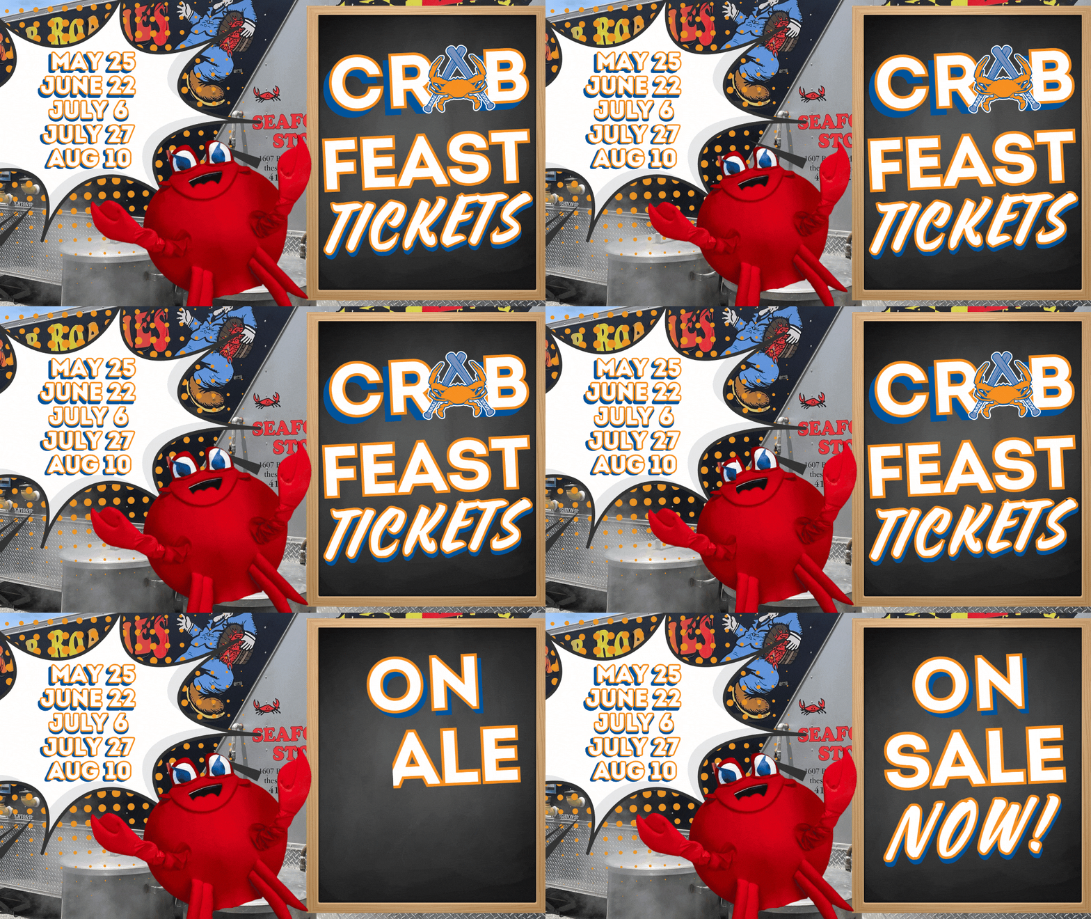
The IronBirds most popular ticket package, Crab Feast, is on sale now! Tickets go fast so don't wait to get your Crab Feast Seat! Crab Feast dates are: May 25th | June 22nd | July 6th | July 27th | August 10th (PLEASE SELECT SECTION 303 ONLY) Included in the
Aberdeen IronBirds Announce COPA Identity
ABERDEEN, MD., The Aberdeen IronBirds are excited to announce their Copa de la Diversion alternate identity for the 2025 season. For one game, the IronBirds will play as Cencerros Increibles de Aberdeen!
Attain Sports partners with Cal and Bill Ripken in Aberdeen IronBirds
Attain Sports Partners with Cal and Bill Ripken in Aberdeen IronBirds October 1, 2024 (Aberdeen, MD) – Attain Sports, led by experienced minor league baseball operator and accomplished business leader Greg Baroni, today announced it has partnered with Cal Ripken, Jr. and Bill Ripken and acquired controlling interest in IB
UPDATE: Harford Holidays Begin Friday, Dec 6

UPDATE: We are so excited for our Harford Holidays event to get started soon, and appreciative of the excitement surrounding the event! Unfortunately, due to shipping delays on some of the wonderful items that will decorate the ballpark, the first weekend of the event will not be able to happen.
Stolen bases feat highlights IronBirds final series of season against BlueClaws
By: Michael Marcantonini The Aberdeen IronBirds closed out their 2024 season by setting a high-mark for most stolen bases in a single Minor League season since 1974, when they did it this past Sunday, September 8, at Leidos Field at Ripken Stadium. It came down to the season finale, but
Fruit’s gem, two walkoffs carry IronBirds to five wins in six games over Dash
By: Michael Marcantonini Powered by two shutout wins and back-to-back walkoff wins to end the series, the Aberdeen IronBirds won five out of six games over the Winston-Salem Dash this past week at Leidos Field at Ripken Stadium. The IronBirds collected seven wins on their 12-game homestand and enter the
Pitching dominates, Cunningham breaks out for IronBirds in series loss to Greenville
By: Michael Marcantonini In a series dominated by pitching, the Aberdeen IronBirds picked up a couple big wins over the Greenville Drive this past week at Leidos Field at Ripken Stadium. The IronBirds started and finished strong by winning the first and last games of the series, and despite losing
Rebranded Fallpark Fan Fest set for Sat. Oct 19!

Welcome to the Fallpark Fun Fest at Leidos Field at Ripken Stadium on Saturday, October 19 from 4-7pm! Tickets start at only $15 and include all activities from tractor hay rides, to kids zone fun, trick or treating and other FREE activities at the Fallpark! Enjoy an evening of family
IronBirds fight through rain to split low-scoring series with Cyclones
By: Michael Marcantonini The Aberdeen IronBirds powered through rain and thunderstorms to split a six-game series with the Brooklyn Cyclones this past week in Aberdeen, which was their first full homestand in over three weeks. All six games were decided by four runs or less, including three one-run games, and
4 Pitchers Combine for Third No-Hitter in IronBirds History and First in Aberdeen
The Aberdeen IronBirds made history with their 4-0 win over the Wilmington Blue Rocks this past Friday night when pitchers Zach Fruit, Deivy Cruz, Preston Johnson, and Kyle Virbitsky, along with catcher Adam Retzbach, teamed up for the third no-hitter in franchise history, and first at Leidos Field at Ripken
Josenberger, Tejada blast walkoff homers on IronBirds 9-game homestand
By: Michael Marcantonini The Aberdeen IronBirds just wrapped up their longest homestand so far this season with five wins in nine games at Leidos Field at Ripken Stadium. The IronBirds won five of six over the rival Brooklyn Cyclones, before dropping all three games against the Greensboro Grasshoppers. The IronBirds
Willems’ walkoff blast, Sunday’s 15-run outburst highlight IronBirds’ series win over Crawdads
By: Michael Marcantonini The Aberdeen IronBirds stayed hot at the plate on their way to four wins in six games over the Hickory Crawdads last week at Leidos Fields at Ripken Stadium. It’s the IronBirds’ third six-game series win of the season and they’re now 9-5 in June. Both team’s
Red, White & Boom 2024 is Back!
It’s back – Red White & Boom returns to Leidos Field at Ripken Stadium on Thursday, July 4 from 6pm -10pm. Join us for Harford County’s best Independence Day celebration! Tickets start at just $15 and includes a commemorative color changing Red, White, & BOOM! Cup with unlimited access to:
Portes extends scoreless streak, Bradfield Jr. heats up as IronBirds split with BlueClaws
By: Michael Marcantonini Dominant starting pitching and timely hitting led the way for the Aberdeen IronBirds as they split a six-game series with the Jersey Shore BlueClaws last week at Leidos Field at Ripken Stadium. The IronBirds earned back-to-back two shutout wins in the series and at one point held
Prado’s big week, shutdown bullpen lead IronBirds to five wins in six games over Renegades
By: Michael Marcantonini The Aberdeen IronBirds dominated the Hudson Valley Renegades with five comeback wins in six games this past week at Leidos Field at Ripken Stadium. It’s the second time in their last two homestands that the IronBirds won five out of six games and they outscored the Renegades
Etzel caps off huge week with walkoff as IronBirds win five out of six over Jersey Shore
By: Michael Marcantonini The Aberdeen IronBirds capped off a thrilling homestand with five wins in six games over the Jersey Shore Blue Claws this past week, including their first walkoff win of the year in the series finale. The IronBirds moved to 11-10 on the season, just two games out
Willems hits 3 HR, Chace racks up 15 strikeouts in IronBirds series split with Blue Rocks
By Michael Marcantonini The Aberdeen IronBirds split a six-game series with the Wilmington Blue Rocks last week in their first homestand of the 2024 season. The IronBirds outscored the Blue Rocks 33-26 in the series and are now 4-5 through nine game this season. The IronBirds dominated their home opener
Aberdeen IronBirds Break Camp Roster Announced by the Orioles
ABERDEEN, MD., The Baltimore Orioles and the Aberdeen IronBirds today announced the organizations High-A Break Camp Roster. The roster is subject to change prior to Aberdeen’s first regular season game on April 5 vs Jersey Shore. Six players on the Break Camp Roster land on the Orioles’ Top 30 Prospects
2024 Crab Feast On Sale Sat. 3/9 @ 12 Noon

The IronBirds most popular ticket package, Crab Feast, goes on sale Saturday, March 9th at 12pm for only $75. Tickets go fast so don't wait to get your Crab Feast seat! Click on the Crab Feast dates below to order tickets: SUNDAY, MAY 26 SUNDAY, JUNE 16 SUNDAY, JUNE 30
Aberdeen IronBirds Announce 2024 Promotional Schedule
The IronBirds today announced their 2024 promotional schedule, which features 17 theme nights, 12 fireworks days, and 5 Crab Feast Sundays. The club also announced that single game tickets will go on sale Monday, February 26th, 2024. Returning theme nights this year include fan favorites, such as Marvel’s© Defenders of
Aberdeen IronBirds Announce 2024 Coaching Staff
FOR IMMEDIATE RELEASE ABERDEEN, Md - The Orioles today announced the coaching staff and player development assignments for the Aberdeen IronBirds. FELIPE ROJAS, JR. will serve as the IronBirds manager for the 2024 season. Joining him will be hitting coach ZACK COLE, pitching coach JORDIE HENRY, fundamentals coach CHARLES BOLDEN,
Aberdeen IronBirds announce 2023 Community Year in Review, 2024 Community Partners
ABERDEEN, MD., December 22, 2023 Celebrating 21 seasons of IronBirds baseball at Leidos Field at Ripken Stadium, the IronBirds are also proud to serve as a strong advocate for our local community leaders, volunteers and organizations to make a difference. Throughout 2023, the Aberdeen IronBirds made over 270 donations to
Virbitsky’s gem, Basallo’s monster week highlight IronBirds’ sweep of Drive to end 2023 season
By: Michael Marcantonini The Aberdeen IronBirds wrapped up their 2023 season with a six-game sweep of the Greenville Drive this past Tuesday through Sunday, September 5-10, in front of energized crowds at Leidos Field at Ripken Stadium. The IronBirds outscored the Drive 36-21 in the series and finished the season
Basallo, Prado stay hot while two walkoffs propel Birds to series victory over Blue Rocks
By: Michael Marcantonini The Aberdeen IronBirds took four of six games from the Wilmington Blue Rocks this past week in Aberdeen in a series highlighted by two walkoff wins. All six games were decided by two runs or less with the last five decided by just one run. The IronBirds
Bright shines, Burns torches in tough series against Crawdads
By: Michael Marcantonini The Aberdeen IronBirds were swept in a six-game home series by the Hickory Crawdads this past Tuesday through Sunday, August 1-6. The IronBirds were outscored 53-18 in the series but three of the losses were by three runs or less. The IronBirds sit at 49-50 overall and
